EMAIL ME: savnyre@gmail.com
FIND ME ON SOCIAL


CITADEL COLOUR APP
Citadel and Warhammer are part of the top stocks being sold in Europe right now. Warhammer painters often use Citadel paints. Citadel has created an app to show all of its colors, techniques, and some model options. We believe that if we created an app with a better navigation system, a better painting inventory feature that you can access from device to device then the Citadel Colour app will be able to grow their community for both newbies and experts, and have an all-in-one experience for users.
Two UX Designers
Approx Two Months
Figma
Google Drive
Miro
Adobe XD
Zoom
Miniature painters who have a large collection of paints need to feel better equipped to manage their inventory because their collection is always growing, and they can feel stressed out not knowing what paints they already own and don't want to purchase duplicates unnecessarily.
In order to gain preliminary data to address our research objectives, six known miniature painters in the local community, (whose reputations claim are of a range of beginner, intermediate, and advanced levels of painting technique) were contacted and requested to participate in 1-on-1 interviews. Each interviewee will be called via Zoom and asked the interview questions. The calls will be recorded upon the interviewee’s acknowledgment and the answers they provide to each question will be recorded in a Google Sheet document. Each participant’s answers will be evaluated with empathy maps and the data will be reviewed as it becomes necessary to narrow down the problems our team and stakeholders will be best benefitted from solving.organize the information into different diagrams to identify the paint points and solidify what the problem was with the current app.
We decided to interview five current miniature painters who had both used the app and not used the app, asking them what features bothered them or what features they wished were in the apps.
“...They have lots of weird names so it is kind of confusing and it makes it hard to identify which paint is which, but, for the most part, since I only work with maybe 10-12 colors, it’s not that difficult… but, if I had more of a collection I could see it getting mixed up more.”
“It would help me keep it all cataloged. So if I got out I know what I already have. I would also like to mark which ones I need to get more off. Especially shades, they go on everything and anything so they run out all the time. So yeah. Basically what I have and what I have run out of.”
Through a survey we found that out of 16 people that only 25% used the app on a more regular basis. Most of our responses, at 50% said they used it when they remembered they had it or when it functioned properly.
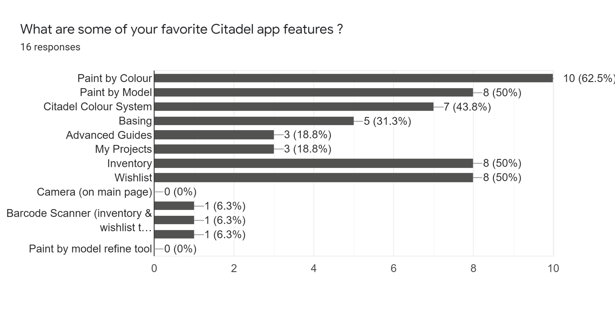
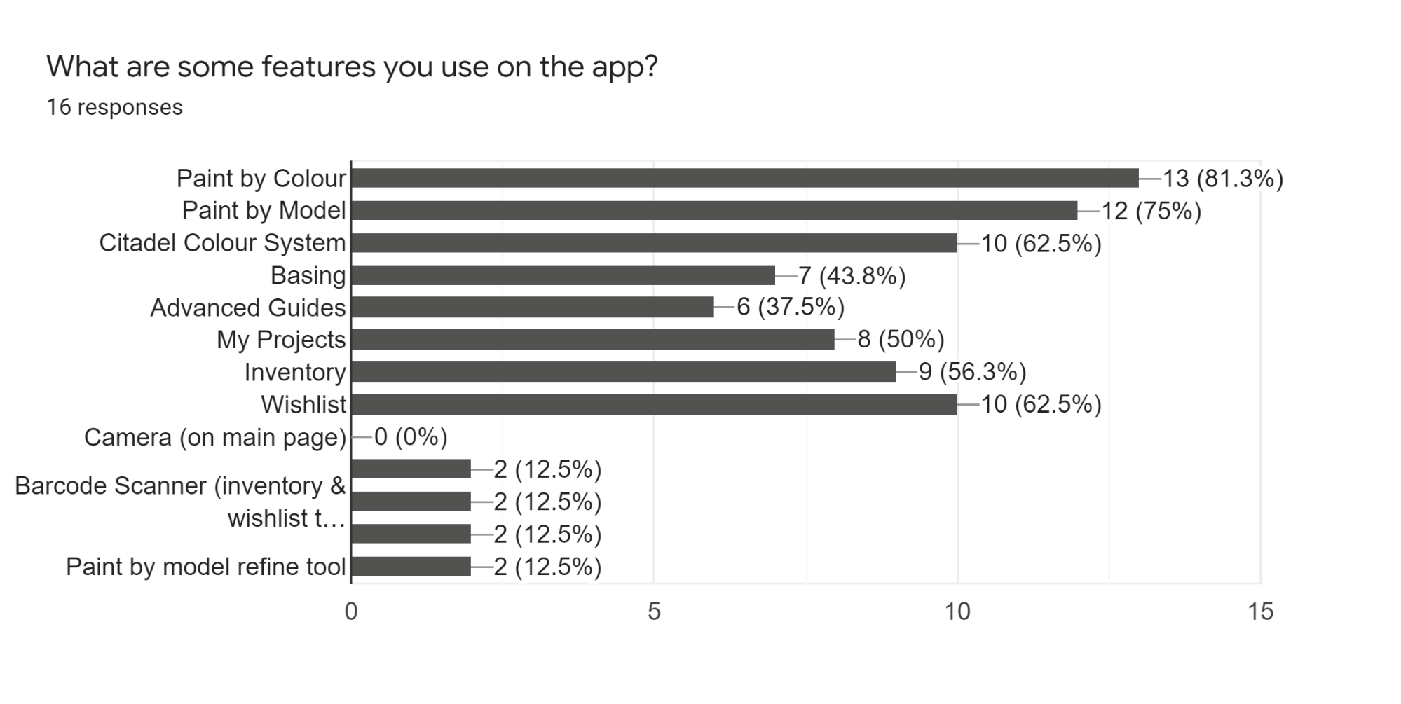
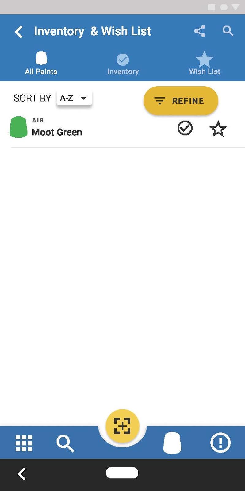
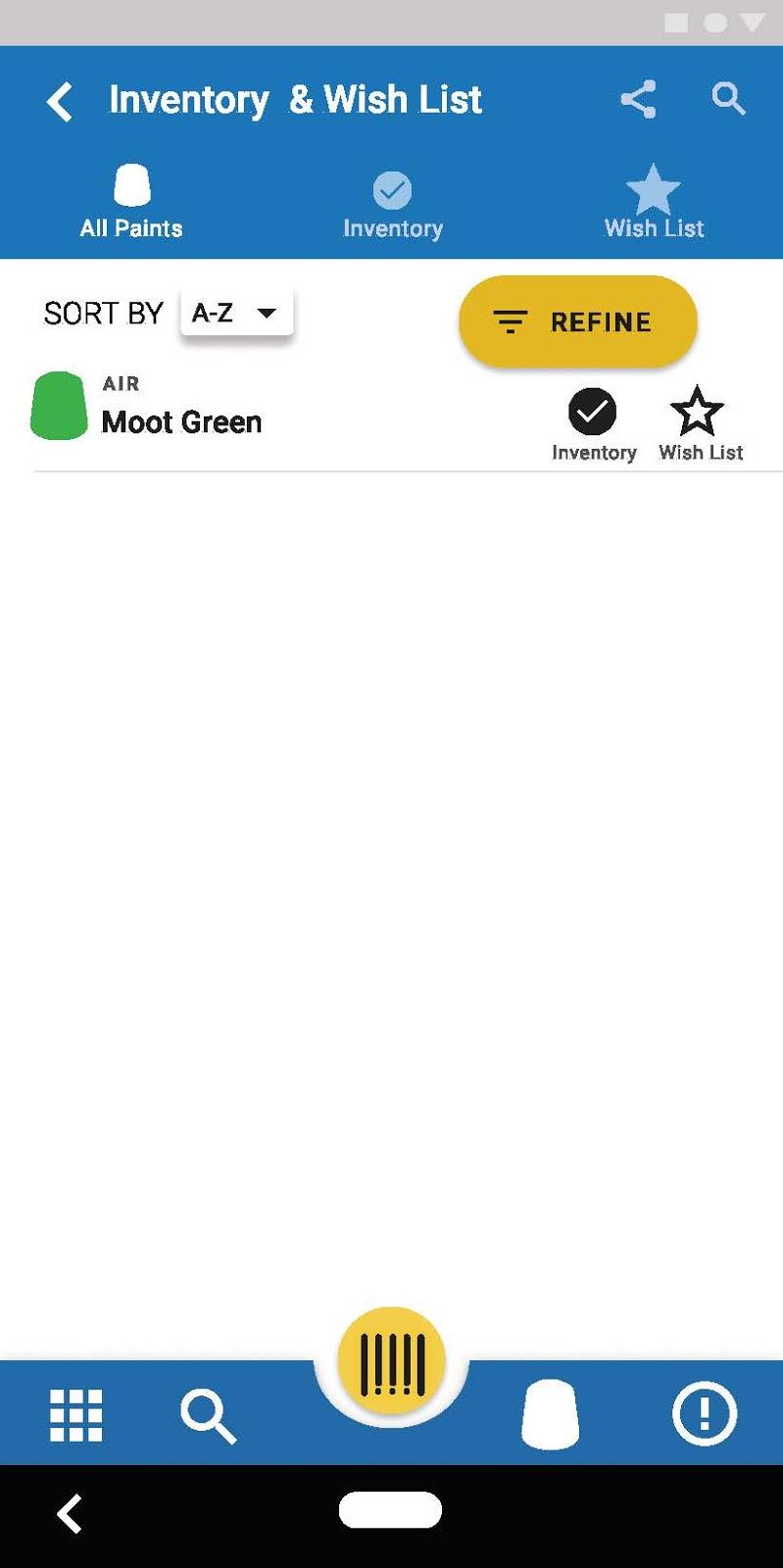
When asked what features of the app users used most often 56.3% said they used the inventory feature. Which allows them to keep track of which paints they currently owned and which paints they would like to own in the future. Another 50% of people said they also enjoyed the Inventory and Wishlist features on the app.
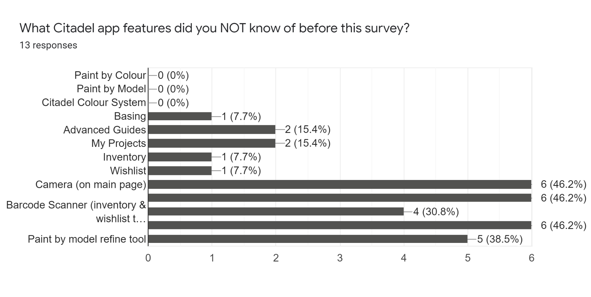
When the UX team was messing around on the app they realized that the app did in fact feature a Barcode scanner, though it was slightly hidden. This was one feature that we realized during the competitive analysis that other apps featured and was very beneficial to have to scan in the apints you already had vs remembering all their names, or typing each one in one at a time.
We then decided to ask in our survey if users were aware of this very useful feature. The majority of our users, 46.2% (out of 13 responses) did not know about the barcode scanner in the app.
One of the very last questions asked on the survey was about the navigation and function of the app. We asked users, “would you want to use the Citadel Colour App (more frequently) if the issues you were having were resolved.” Majority of users, at 81.3%, said yes. So we got to work.
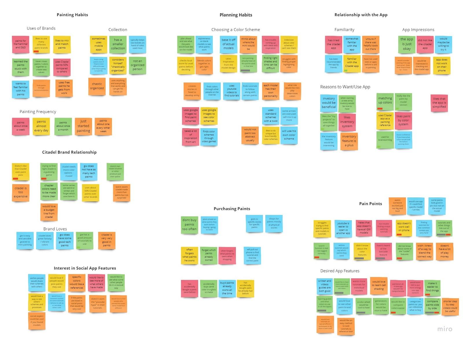
After we interviewed some users we created an affinity diagram. We learned a few different things
expressed interest in an inventory-management app.
suggest they would use the app if it was more comprehensive
help finding specific models, tutorials, or special app features (like the barcode scanner).=
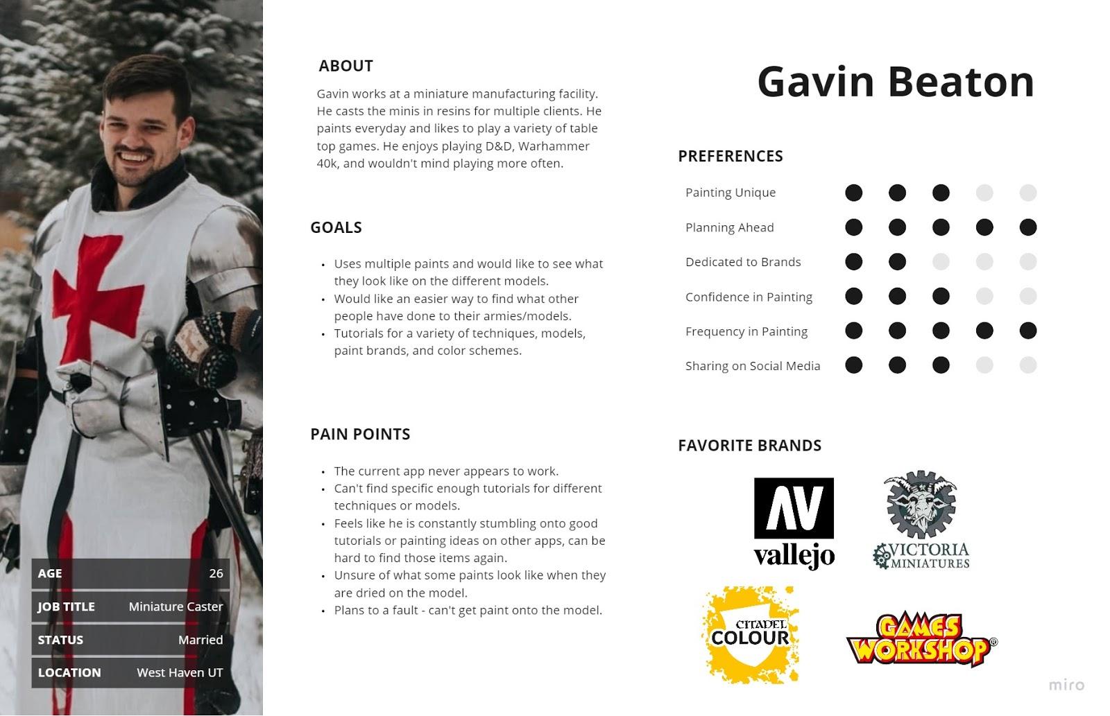
In order to illustrate the key audience of this app and help stakeholders gain more sympathy for their users, we decided to build some personas. We made a persona for each person we interviewed, as there were both current and potential users for the app. This can help illustrate the users different pain points they had with the Citadel Colour App.
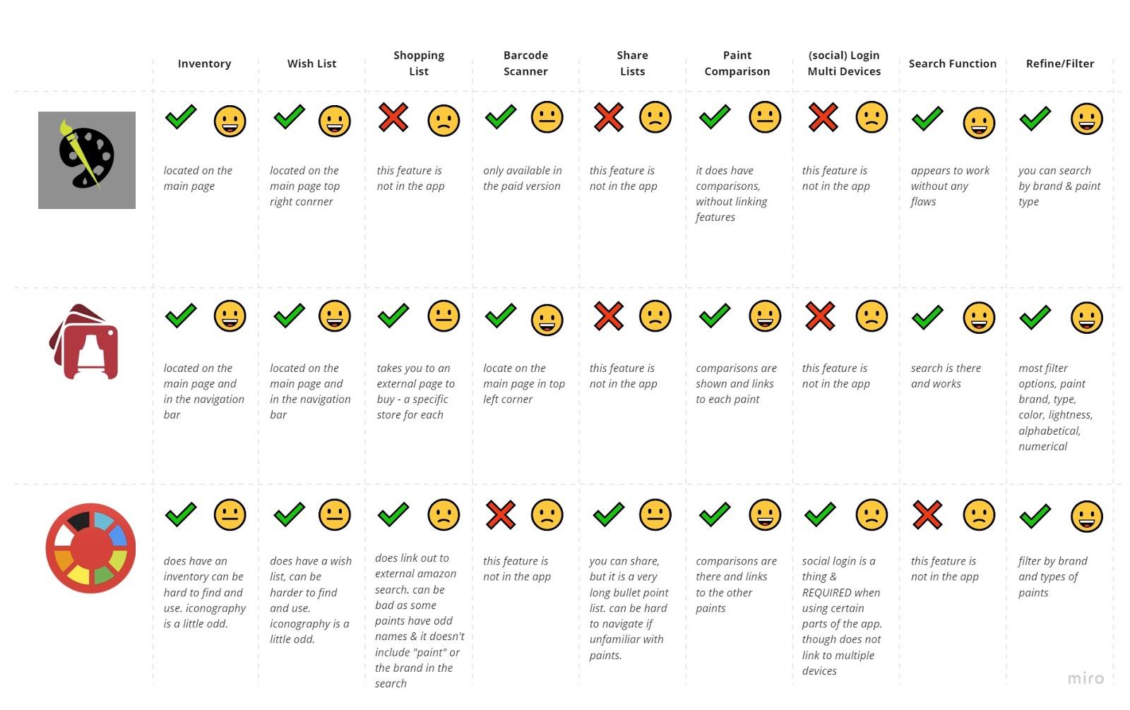
We found three different apps that could compare to the Citadel Colour App. These three apps included, Paint Inventory Lite, Mini Paints, and Hobby Color Converter. These three apps had similar and also different features for hobby painters.
Criteria of comparison: after studying the different apps we decided that there were some features we thought would be good to have on the Citadel Colour App. These main features included, Inventory, Wish List, Barcode Scanner, Sharing Lits, Paint Comparisons, Login on Multiple Devices, Search Function, Refining or Filtering Searches, and Shopping Lists. With each of these categories we noted if they had the feature by using a checkmark for yes, or an x for a no. We then marked how user friendly the feature was by using a smiley face for “easy, good, amazing”, a straight face “for it could be better”, and then a frowny face for “this is bad, hard to use, or not good at all.”
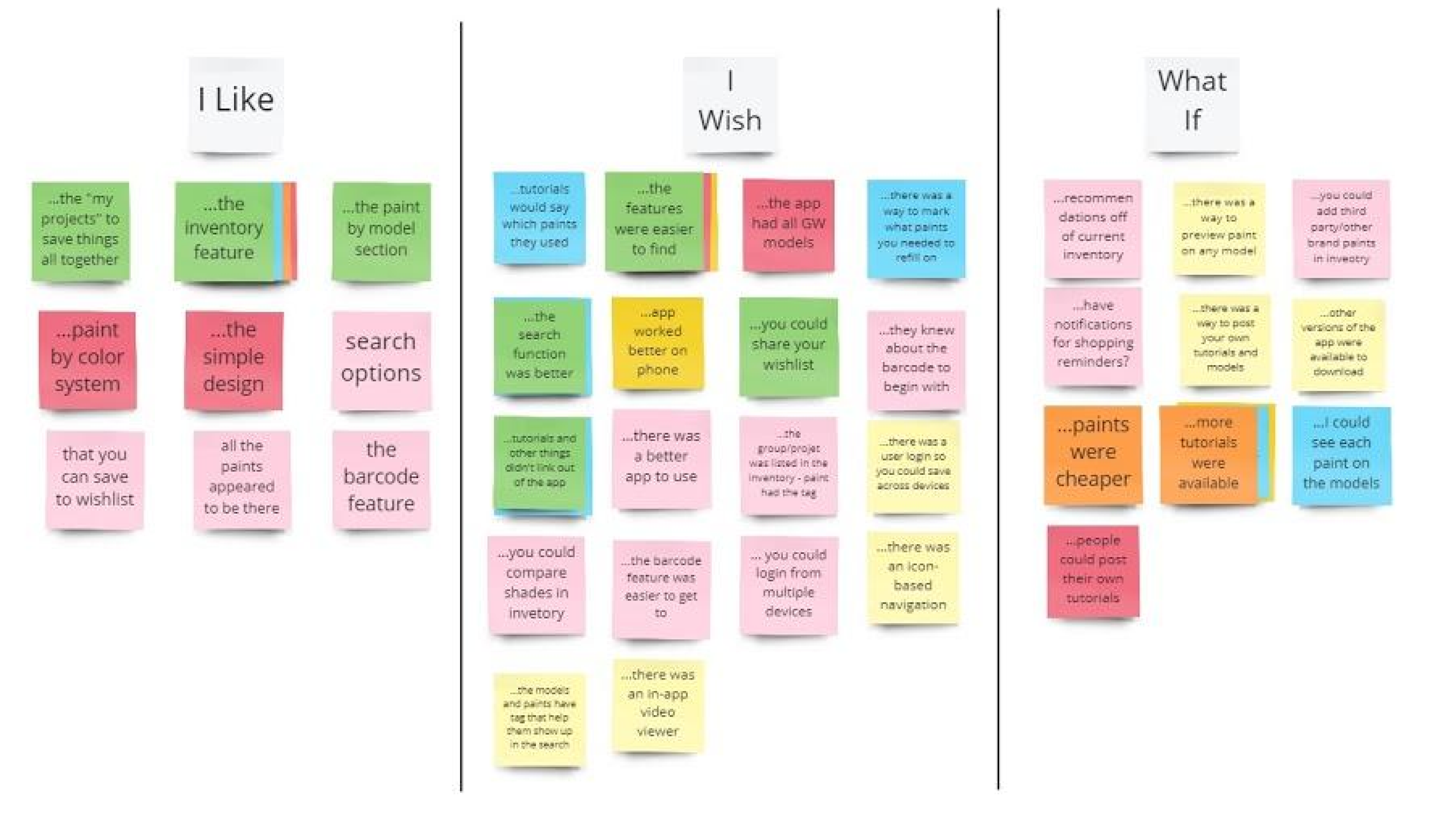
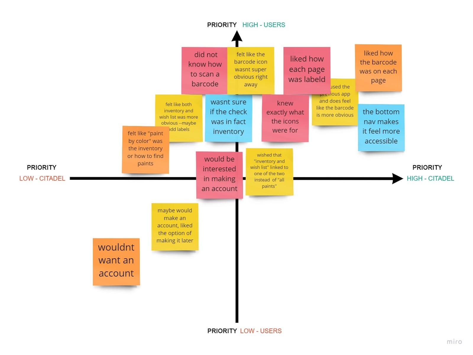
After interviewing users and adding some of our own ideas to a board, we then categorized them into I Like, I Wish, What If. This helped the team decide which kind of features we should focus sooner rather than later.
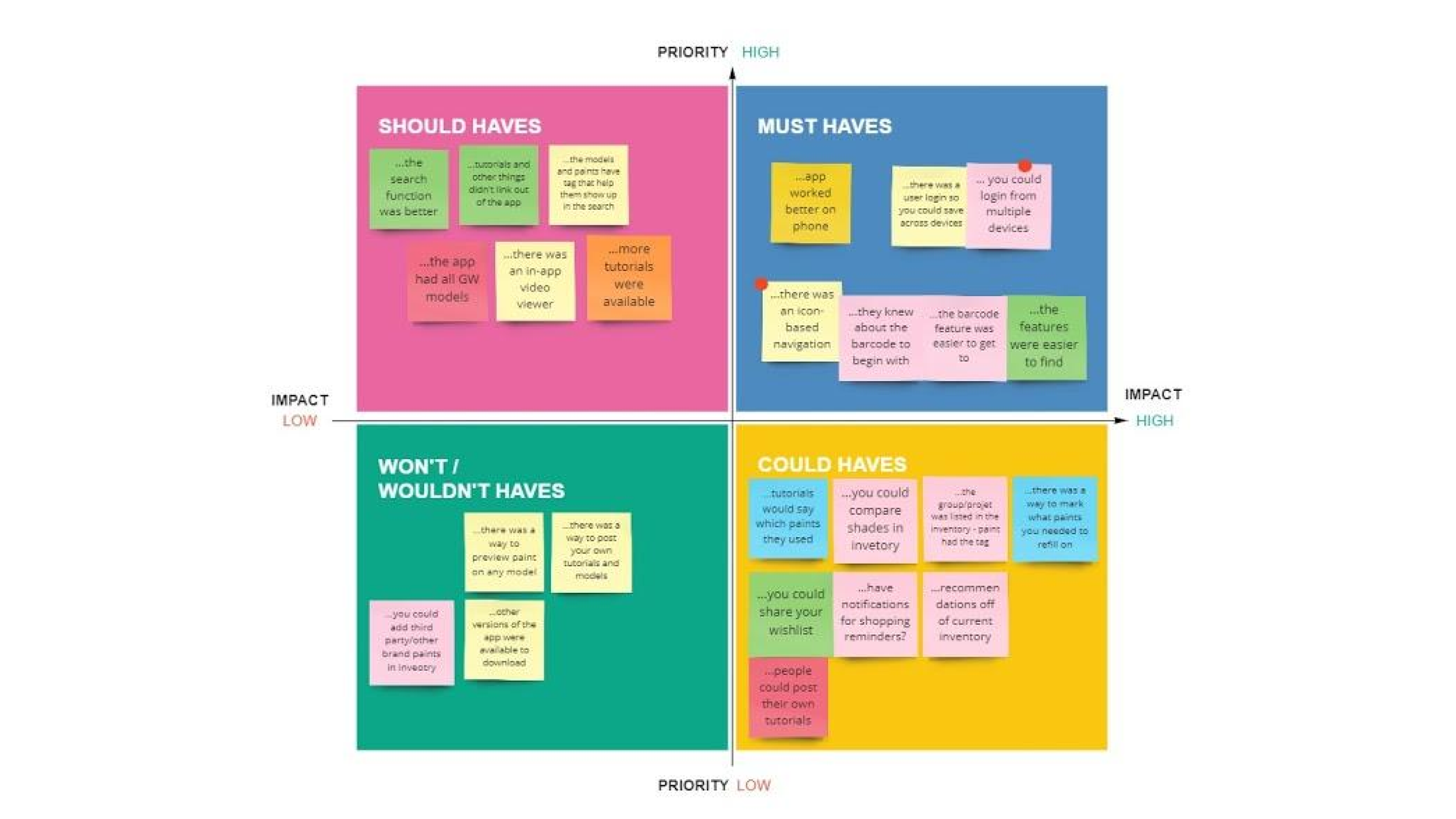
Taking the same features from the interviews and our own we made a prioritization matrix, evaluating each idea as high vs low priority and high vs low impact. With the combination of knowing what things to focus on in the future vs now using the I like I wish and What If matrix, combined with the prioritization matrix we could start narrowing down our ideas to the most important ones.
Once we had narrowed down our ideas from above, we made a User Journey Map. This helped us know what the user scenario was, their goals, and what kind of feelings they had as they went through the processes of using the app.
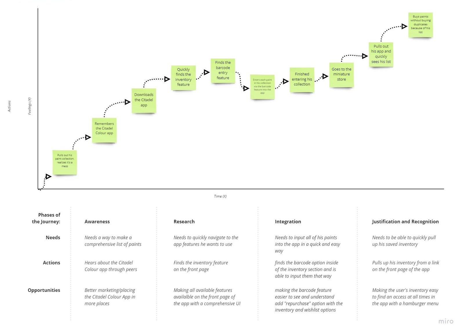
Chris is a hard-working, hard-playing guy who loves his hobbies but knows he needs to be more organized.
Chris wants to organize his miniature paints before he goes to the store so he knows everything he has. He downloads the Citadel Colour app and quickly identifies the inventory feature through the simple UI of the app. He identifies and catalogs all of his Citadel paints by scanning in their barcodes directly into his inventory.
Chris quickly and easily creates an inventory of his paints in the Citadel Colour app so he knows what paints he has when he goes to the store.
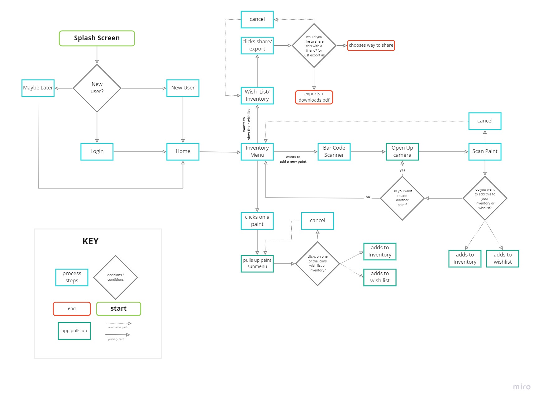
To help the team create sketches and prototypes we made a user flow. This would help us know which screens went to each section. This also allowed us to have a similar process but allow us to design different looks and feels to see which one the users preferred.
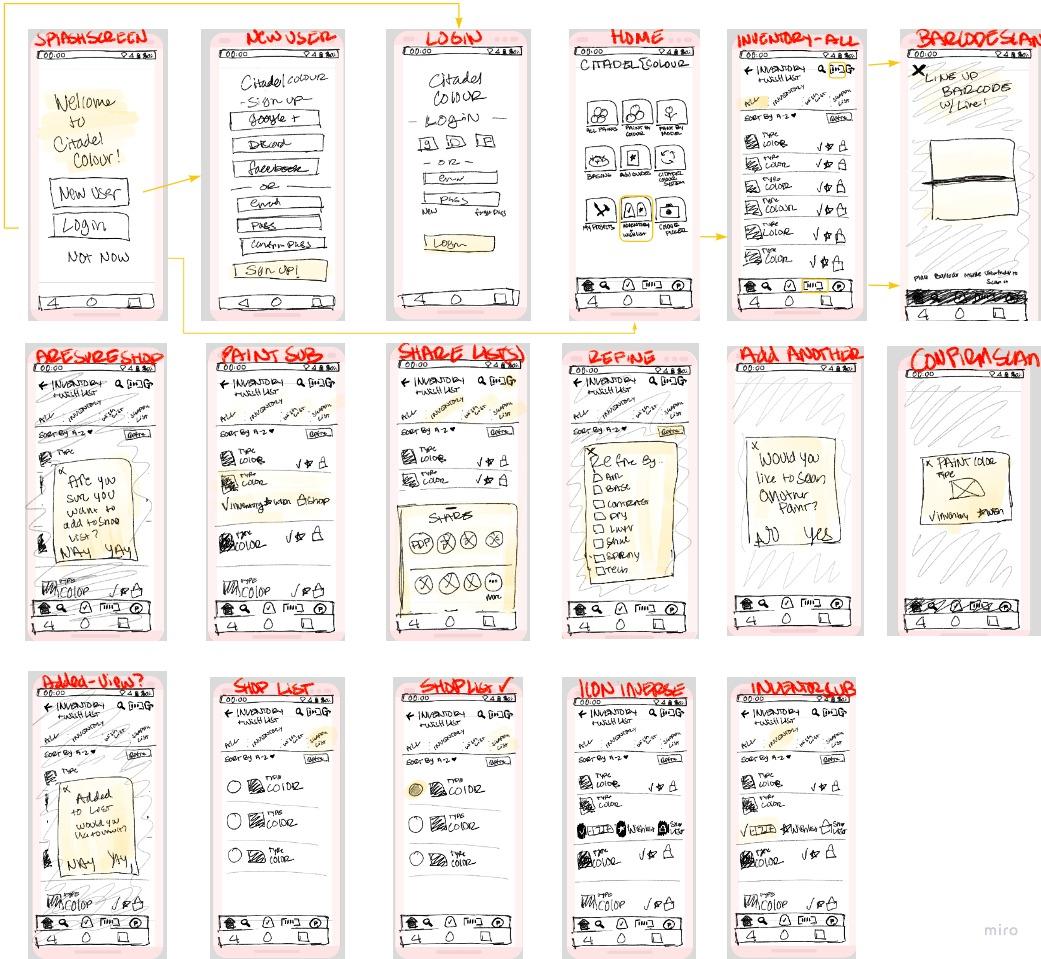
We tested our prototype to learn about the usability of our new app design. There were a total of four tasks to complete. The first being to scan a paint with the barcode scanner, next add a paint to the inventory, third adding a paint to the wish list, then ending with finding their inventory and wish list items. During each test we timed them and did not control them or tell them where to go when using the app. Generally the notes are positive. Most knew how to use the app and felt like it was easy to understand. Each user, if they failed a task, failed in a different way. The one loss we did get, was not due to them not knowing how. But as a result of the prototyping and the web browser not pulling up the app correctly.
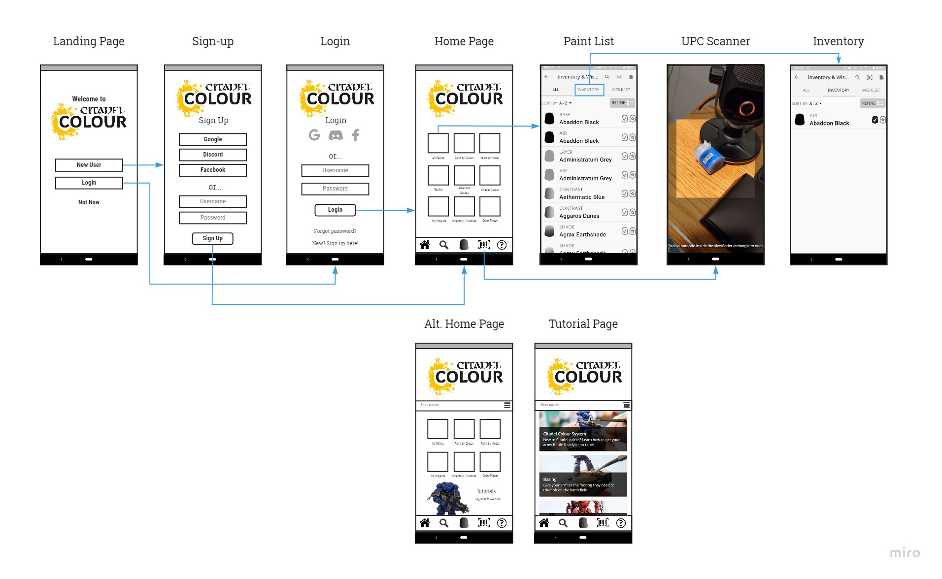
Some key learnings we discovered are that some icons still needed some more clarification to what they were. So we changed the barcode + sign into an actual barcode instead. We also learned that the user experience did overall improve over the original apps design. We felt like more of our users were happier in using our prototype than using the app as it currently stands. We also learned that not everyone would want an account. So we made it optional. You can have one if you want, but it would not be required, as it currently is, and your data would just be saved to your phone and the single device only. The user interface significantly improved the time it took to use the app and find the key features. Only once did it not work successfully.
We both got really excited about this app. We wanted to grow it to its full potential. Therefore, we had too many ideas at the beginning. We wanted to add a social feature, shopping features, comparisons, and 3D rendering. We literally wanted to grow the app and really Citadel’s business. When we finally just decided, and really came to terms with, just fixing the really cool barcode scanner, inventory, and wish list functions we really managed to produce a great app.
We both wish we would have realized our flaw sooner so we could have asked better questions just relating to those key elements during our user interview questions. We had questions when redesigning some aspects of the app that we wish we would have known what some users would say. Yes we did user testing too, but beforehand it could have been really beneficial.
If we were to continue this project, adding in a feature that allows you to click on the color, and find out what minis it traditionally belongs too could be beneficial. A few people had mentioned that in our user testing and our user interviews. Another feature that could be added is a color scheme helper. It could show complimentary colors and even help you create a color scheme based off of the paint you selected.
SAVANNAH HOPE NYRE
EMAIL ME: savnyre@gmail.com
FIND ME ON SOCIAL