EMAIL ME: savnyre@gmail.com
FIND ME ON SOCIAL


PROVEN LAYOUT 2.0
Oozle Media strives to provide their clients with the best converting website. The web dev team decided our original Proven Layout needed a face lift. Our previous templates had been used so frequently and for so long we believed it would need to be updated with the latest and greatest conversion rate optimization techniques. So that’s what we did.
4 Web Dev Employees
Approx Three Months
Figma
Google Drive
HotJar
Zoom
The old templates still worked, in fact we haven’t told any of our clients we needed to upgrade them right away. But we had made them a few years ago by this point, new studies had come out showing how we could make a better template for our clients to use. Oozle Media has always had the goal of getting our clients the best conversion rate possible - you don’t just do that with good ads, you need a good website too.
We found that the majority of our larger clients had two types of forms for potential students to fill out. These included the subheader form and the request info form. The subheader forms struggled to stand out form sites as they blended in with their site a little too well. We also found that the old horizontal forms were not converting as well.
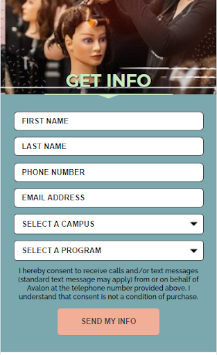
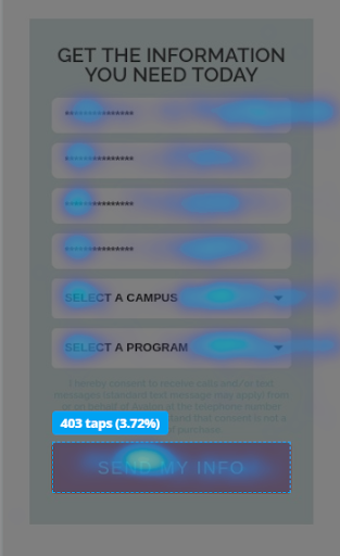
We also concluded from CRO reports that our forms needed to have a different order for form fills. Instead of starting with “First Name” and “Last Name” we found that if we started with “Campus of Interest” and “Program of Interest” more of our forms were filled out.
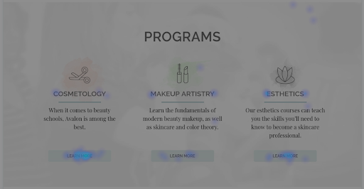
We determined that our old proven layout had some issues with converting some very specific calls to action areas. This included our header buttons (specifically on mobile) and our programs section on the programs page.
With the header buttons we concluded that most users probably didn’t see them on desktop as they were “too high” on the page. Users also appeared to not click them on mobile as they looked too close to banners vs a button.
On each program page we traditionally had a section with all the programs listed on the site. The problem we were experiencing was that every time a user was on a Cosmetology page, for example, they would make their way through the page and see the programs listed towards the button and click on the cosmetology “learn more” button. They were already on that page so we needed to make sure our new template only listed the other programs and not the one they were currently on.
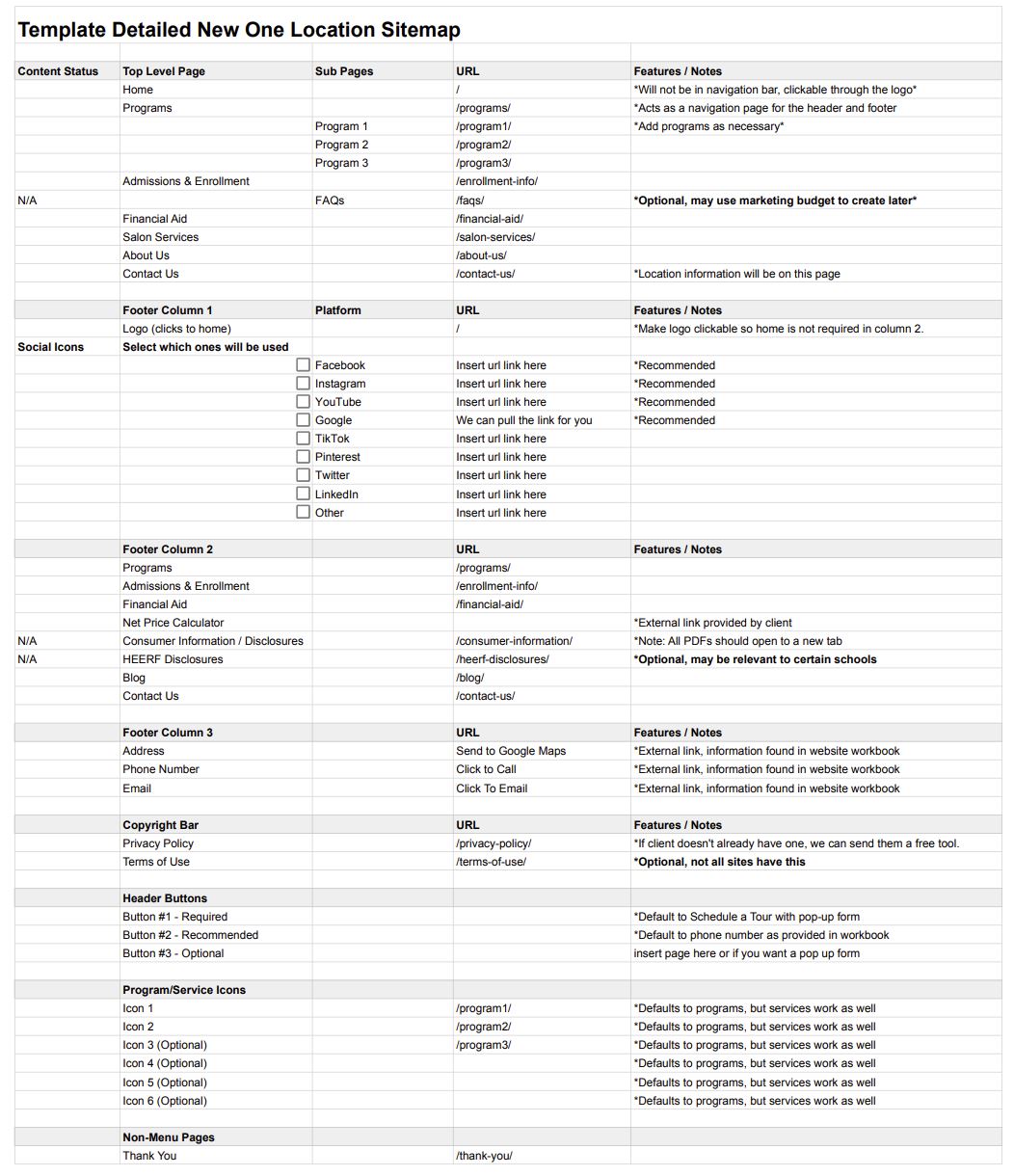
Using our knowledge of Cosmetology Schools we created a standard template sitemap. This could easily be changed for any client but it would allow us to have a basis for any client. It sped up our creation process overall, and allowed multiple people in Oozle Media to learn about site mapping and would be able to create an efficient sitemap for anyone.
Lowered the header buttons to be more inline with the logo. Made it possible to have a button within the subheader image. Created a vertical form that overlapped with the subheader image and encouraged the user to scroll further down the page. Added CTA bars that went across the entire width - and once colorized would stand out from the site. Added picture options to our testimonials bar. We found that students liked seeing faces with their reviews as it made the review feel “more real”. Added three buttons to our location switcher that can draw students to look at that specific location, schedule a tour, or view the salon services at that location.
Created more recommended sections for the clients or our content person to use to write insightful information to convert more students. Would make it that on our programs section on that page to not include the page they were already on.
Added salon hours, address, and contact information for that location. Had a section that only the programs of that page would be included on that page vs all the programs. Created a tabbed menu for salon services and prices. This would also make it more mobile friendly so the user would not have to scroll too long and they would all be in one column.
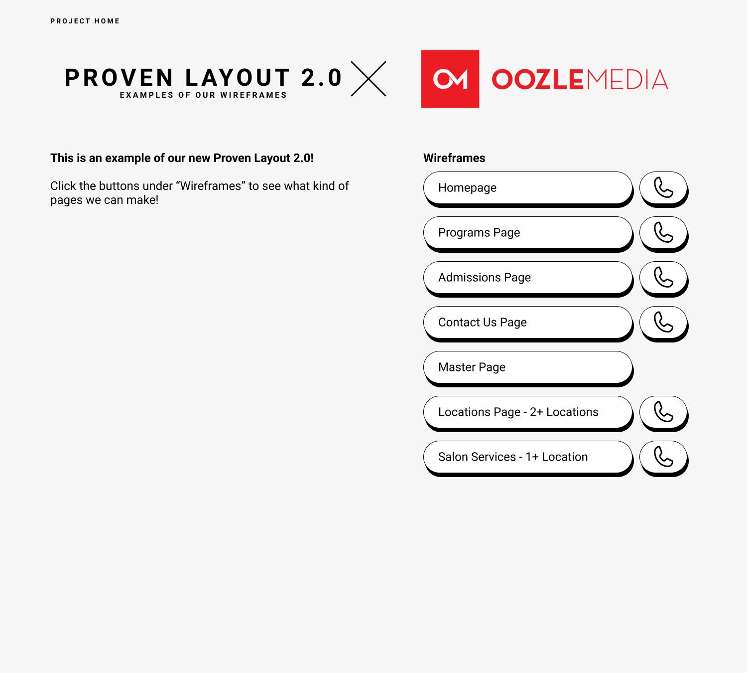
Instead of clients only getting a home page and a programs page we added new pages they could duplicate. Locations Page Salon Services Page Contact Us Page Enrollment Page Master Page The Master Page included all elements that our sites had inside of them that they could reference, duplicate, and/or reorder any way they desired to create new pages once their site was in their hands.
American Institute of Beauty Only some pages are used here. They chose to buy only a few pages vs a whole new site.
(more coming soon!)
Even though it could be best for each client to have their own custom site, they can’t always afford it. By having these templates they are able to have excellent conversion rates without having to buy a whole custom site. We are able to make the template look more like them though! Whether they are edgy, girl-next-door, organic, or geometric we can make the template fit to their needs and their brand!
Continue putting HotJar on all client sites so we can track the conversion rate, as well as the user experience. Then use those results to always improve our product.
SAVANNAH HOPE NYRE
EMAIL ME: savnyre@gmail.com
FIND ME ON SOCIAL