EMAIL ME: savnyre@gmail.com
FIND ME ON SOCIAL


PIONEER THEATRE COMPANY
Pioneer Theatre Company is located on the campus of University of Utah. They use the space that’s on the campus but not used by the students. The building has been there for 100 years. They are the only professional theatre in Utah that has a contract with Actor’s Equity, the professional actor’s union. They recruit actors out of state and house them on campus. Their subscriber base is old and dying out. Most of their audience is “Boomers on up,” and younger audiences are not participating. They have tried offering student tickets, but it hasn’t worked that well. The only way they survive is through donations. Going through the university they get some slack, but their operating costs come from donations versus ticket sales. With COVID shutting down their operations, they have moved to a model of selling custom-made facemasks and pet toys.
Two UI Designers
UI Designer in a group project. My main role was making the prototype and leading the team in the right direction.
Less Than One Month
Figma
Google Drive
Miro
Zoom
Trello
We want to create a post-COVID website that features their upcoming shows alongside a “Donate” button. We want to advertise season tickets, student discounts and other discounts right up front. We also want to create an engaging visual, intuitive design that will be more attractive to younger patrons. We also want to show that there is free parking to overcome a pain point for millennials and Gen Z. We will also highlight that they are close to the UTA Trax station to get more people into the shows.
User interviews will be conducted to collect qualitative data from participants. A survey will be sent out on social media to ask questions about volunteering experiences which will give us some for quantitative data. Both sources will be used to help us understand and create a user persona.
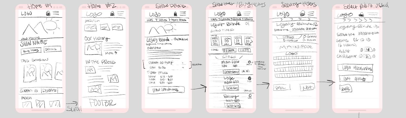
User interviews will be conducted to collect qualitative data from participants. A survey will be sent out on social media to ask questions about volunteering experiences which will give us some for quantitative data. Both sources will be used to help us understand and create a user persona. Once we have gathered the data creating sketches, wireframes, and prototypes will be done simultaneously with user testing to validate any ideas or iterations.
“We offers student discounts and rush tickets. U of U theatre students attend for free. But very, very few of them subscribe for season tickets.”
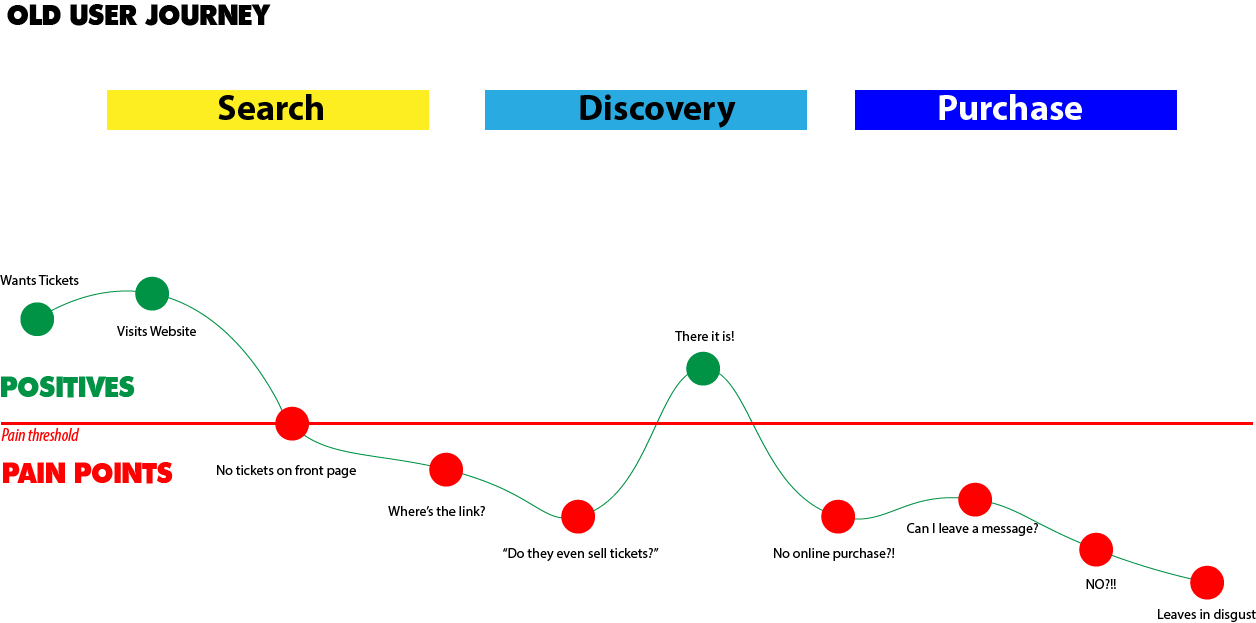
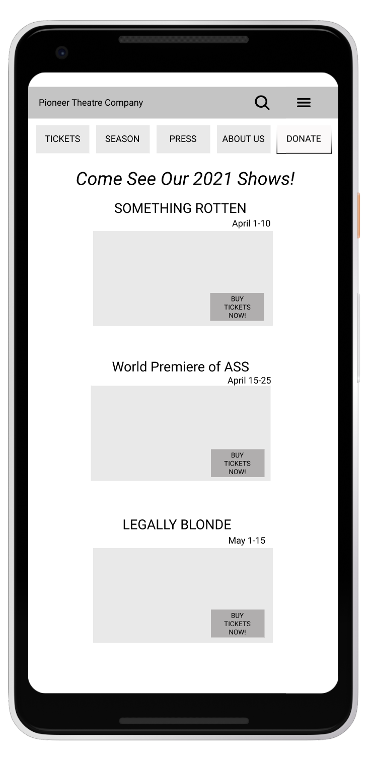
“Why aren’t there tickets on the front page?"
“It won’t even let you purchase tickets online.”
“I thought ‘Masks to Order’ was the name of a play.”
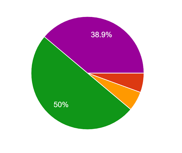
We decided to send out a survey for people to fill out. We wanted younger people to fill it out as we hoped to fix the site to attract a younger audience. Luckily for us, younger people did fill it out. 50% of our survey respondents marked they are Millennials, and then the second largest group was Gen Z with 38.9%.
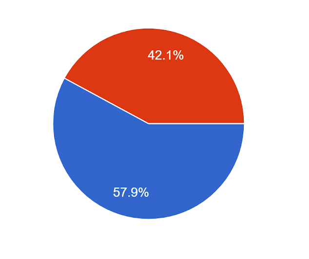
When asked if they had ever heard of Pioneer Theatre company we got a majority of yes with a 57.9%, which was a nice surprise as we thought majority would say no because I hadn’t even heard of it and I was in the target demographic.
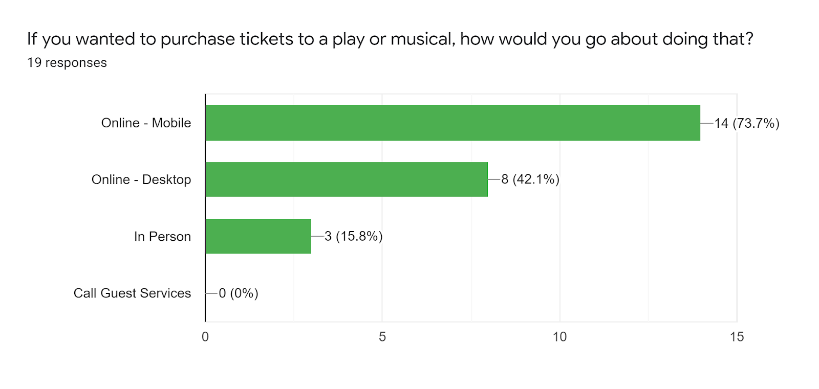
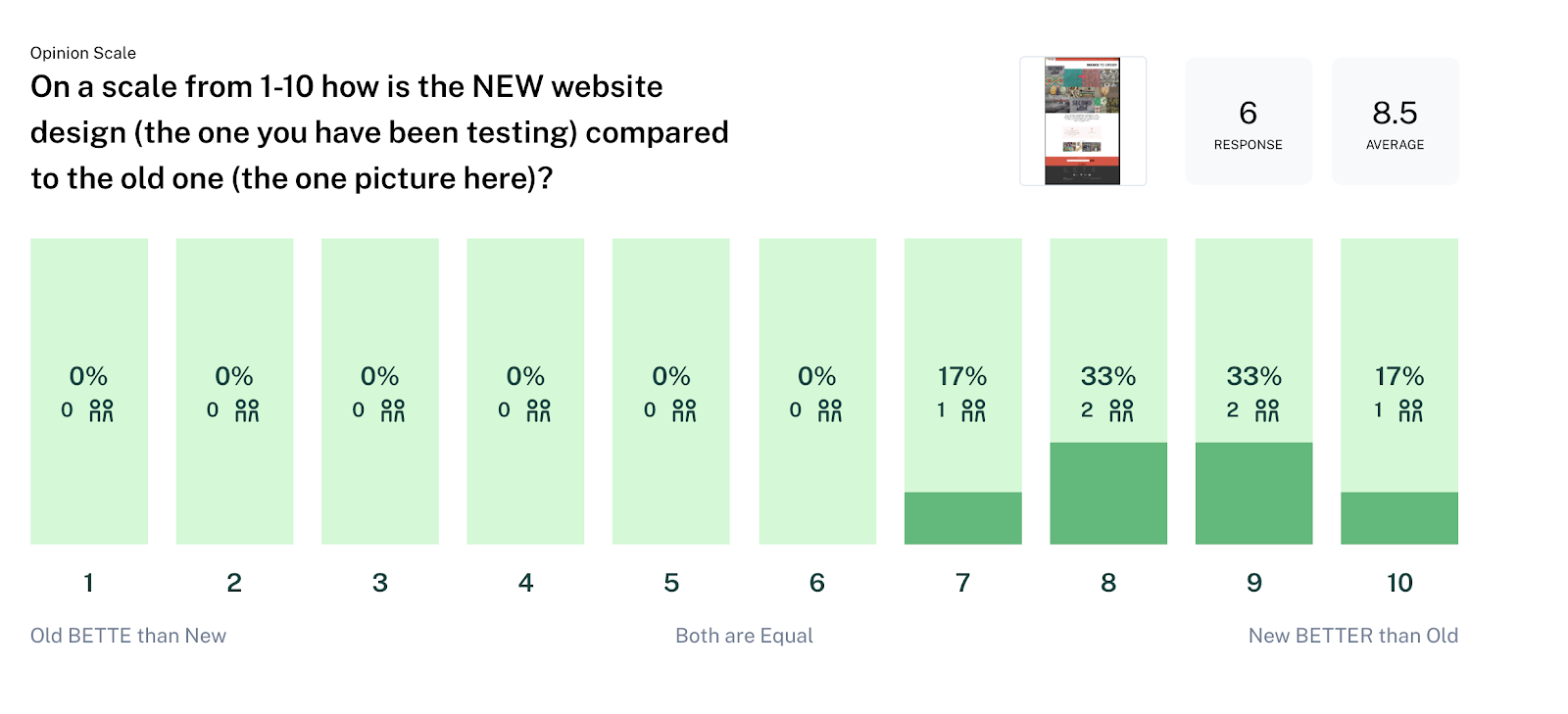
We then asked in our survey how people would prefer to purchase tickets. Majority said online using their phones with 73.7%. The second was still online using desktop at 42.1%. While the least amount was in person at 15.8% which is currently the only way to buy tickets with the Pioneer Theatre Company.
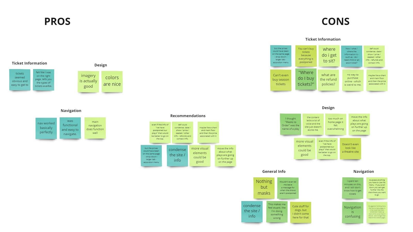
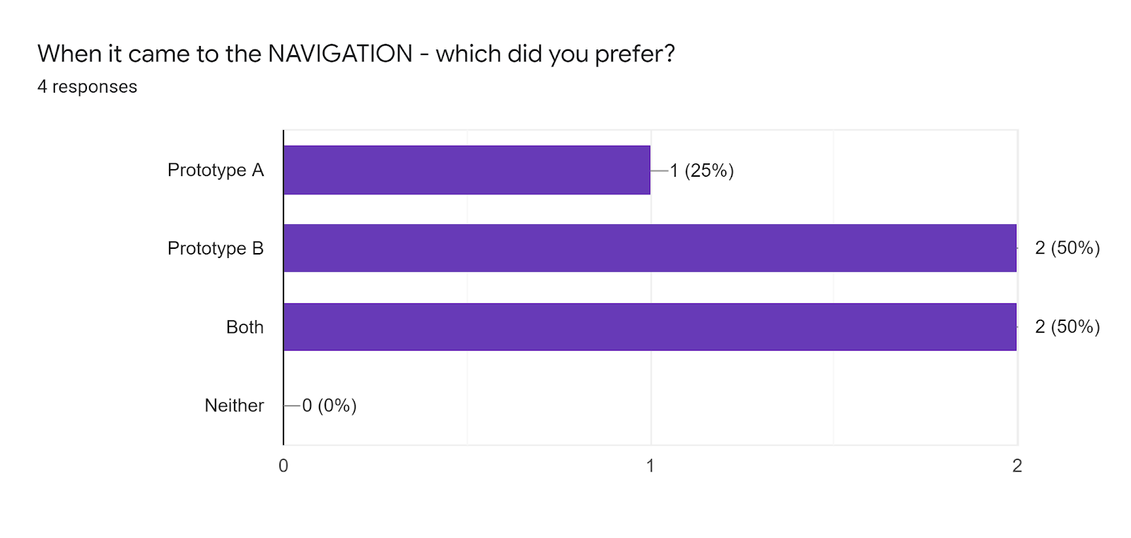
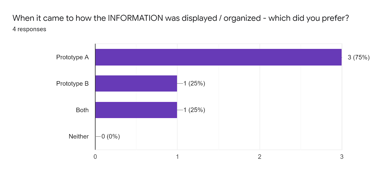
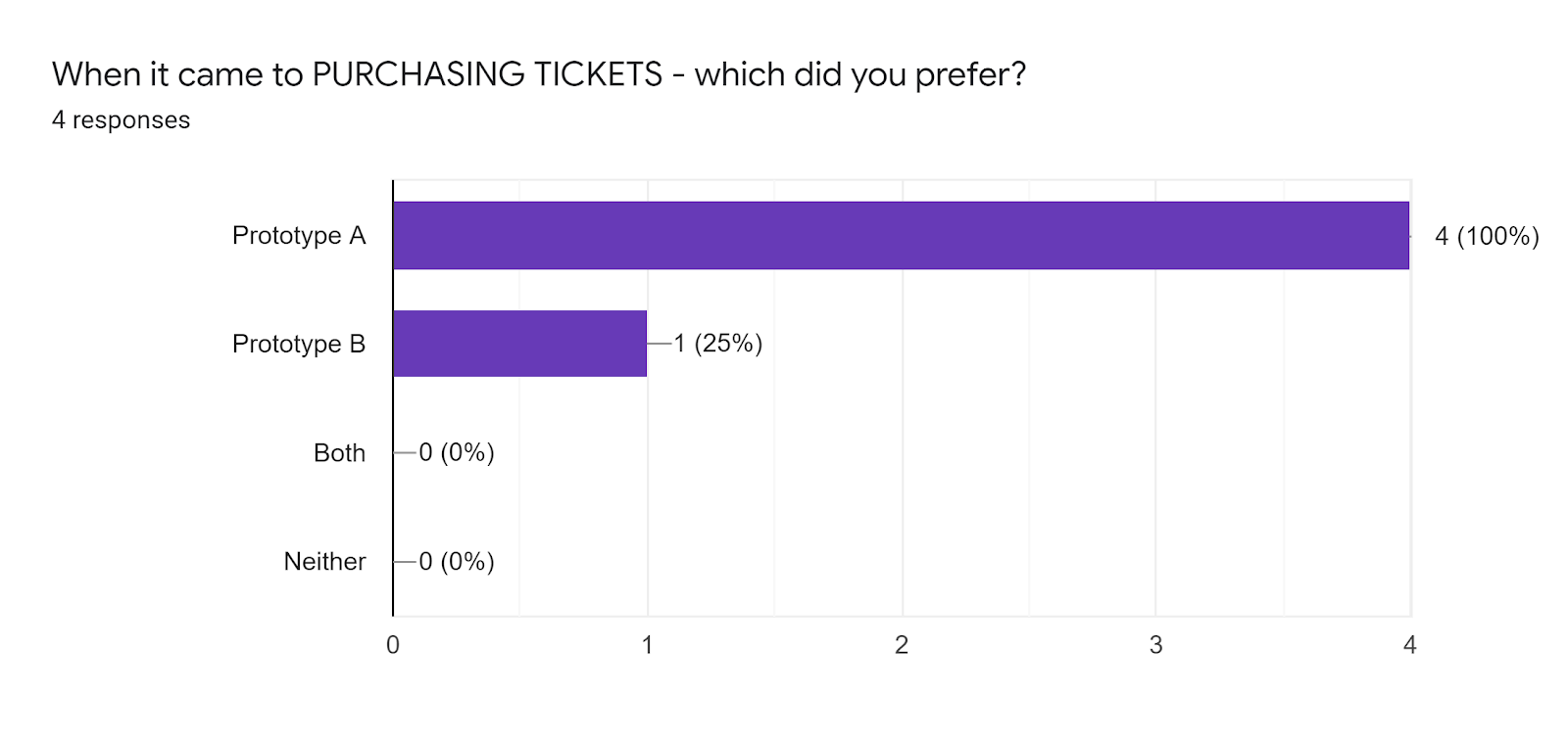
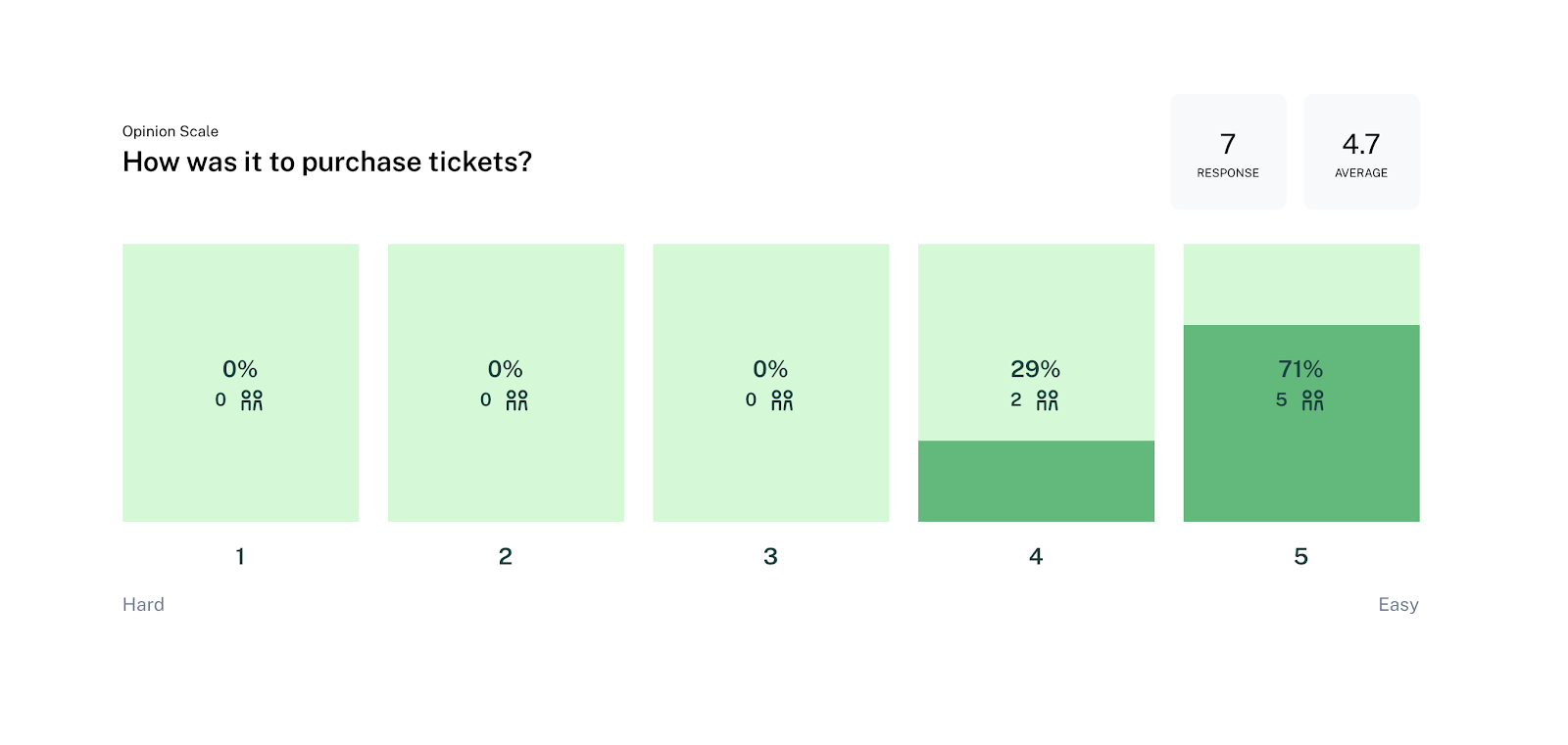
We then took what our users said in their interviews with the current site and turned it into an affinity diagram. This helps us visually see how many cons there were over the pros. This also helps us determine what things we should focus on first vs last. Here you can see that most users complained about the ticket information so we decided to focus on the ticketing information and even adding a online ticketing function.
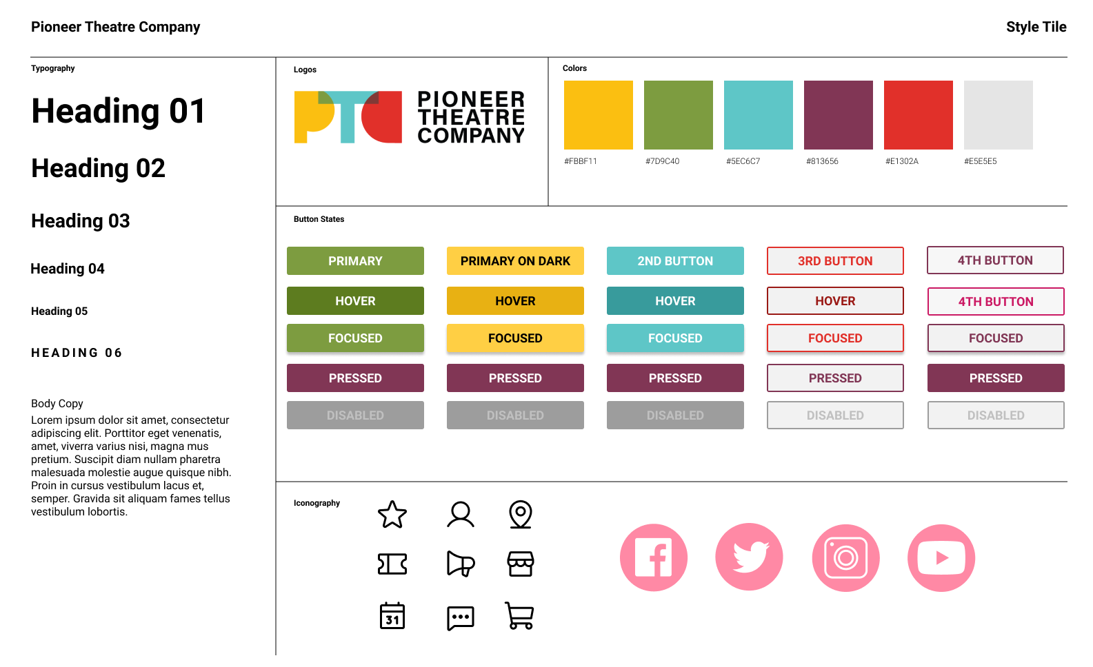
the colors of the PTC logo and their site, though some areas felt a little overwhelming.
that they could not purchase tickets online and that it was kind of hard to figure out how much the tickets were.
to be able to purchase tickets online and not feel too overwhelmed with the process.
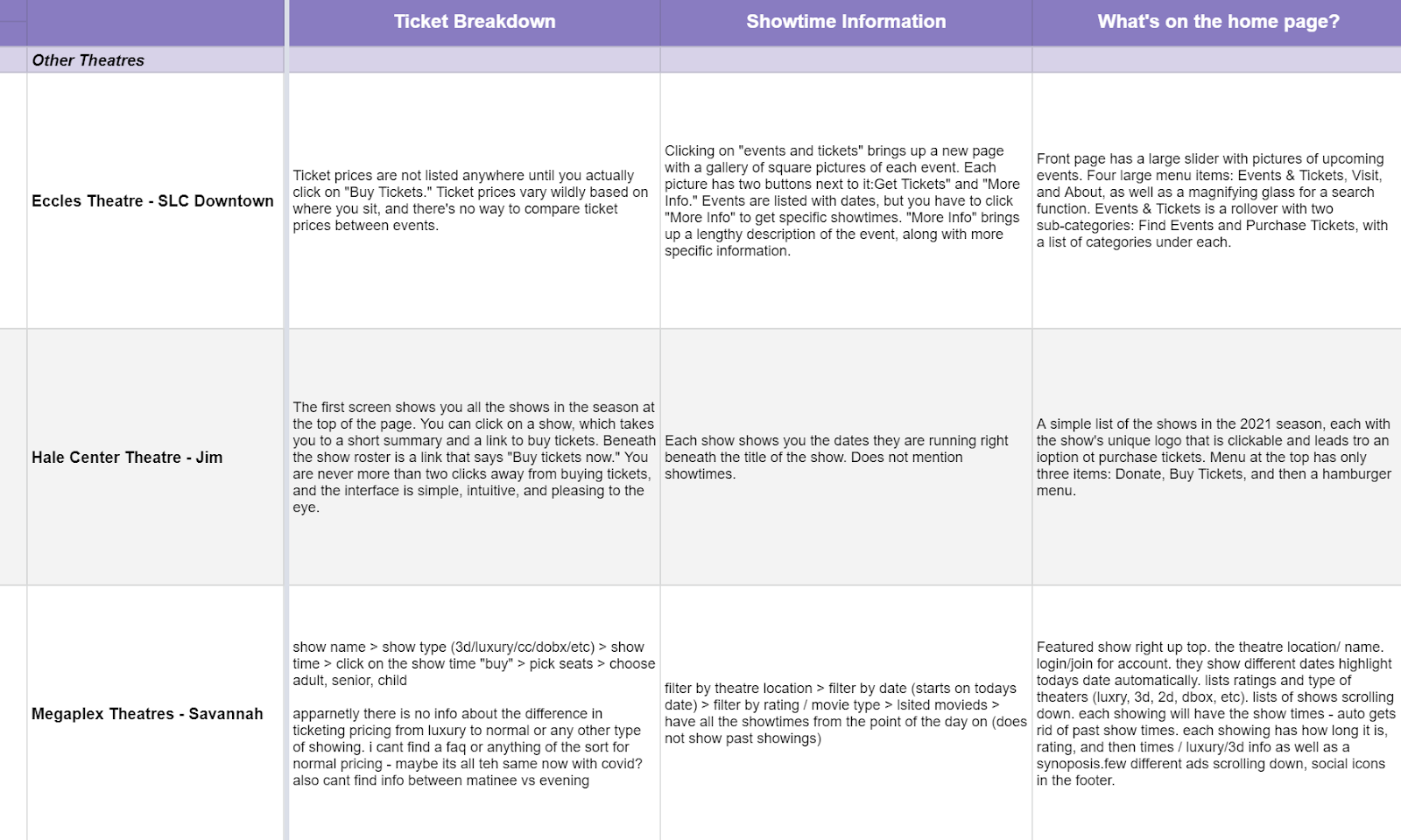
After we completed the affinity diagram we realized that we should do a competitor analysis to see what was out there when it came to purchasing tickets.
Determining who our competition is was tricky. In today’s market, live theatre competes with much more than just other live theatres. Hale Center theatre is the most successful community theatre in the country, so they’re an obvious competitor. But so are movie theatres, which provide a far less expensive quality that is also quality and more convenient, and movies use the web far more than live theatres do.
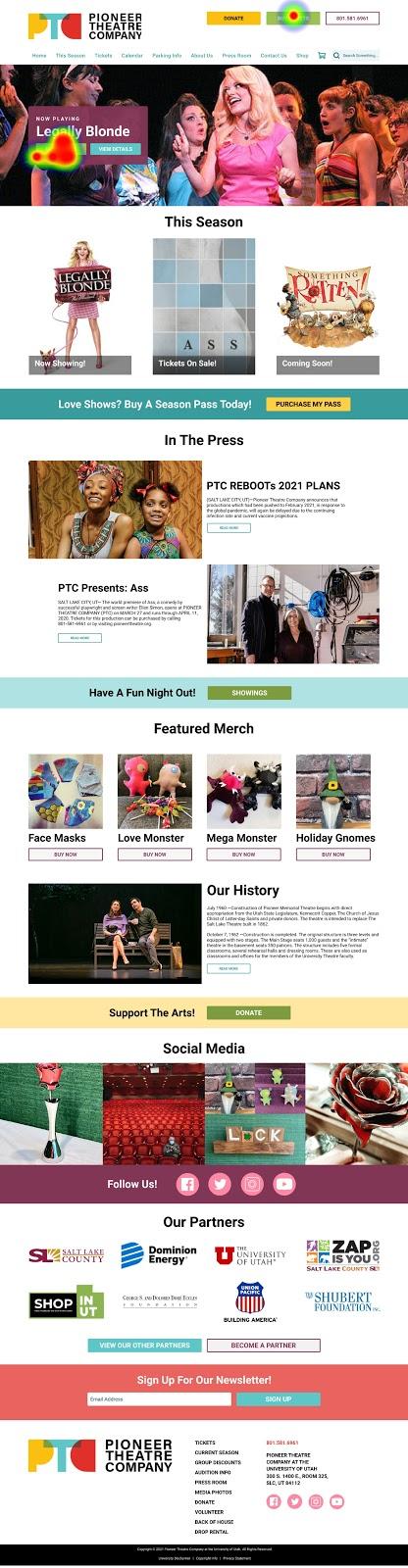
"I would have never guessed that the two sites were related."
paragraphs
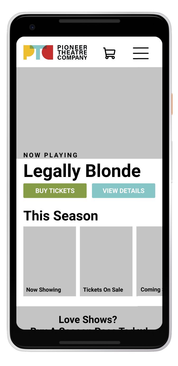
The original site was visually cluttered and unclear. This didn’t directly engage with young users, which meant that they were gone within seconds of visiting the site.
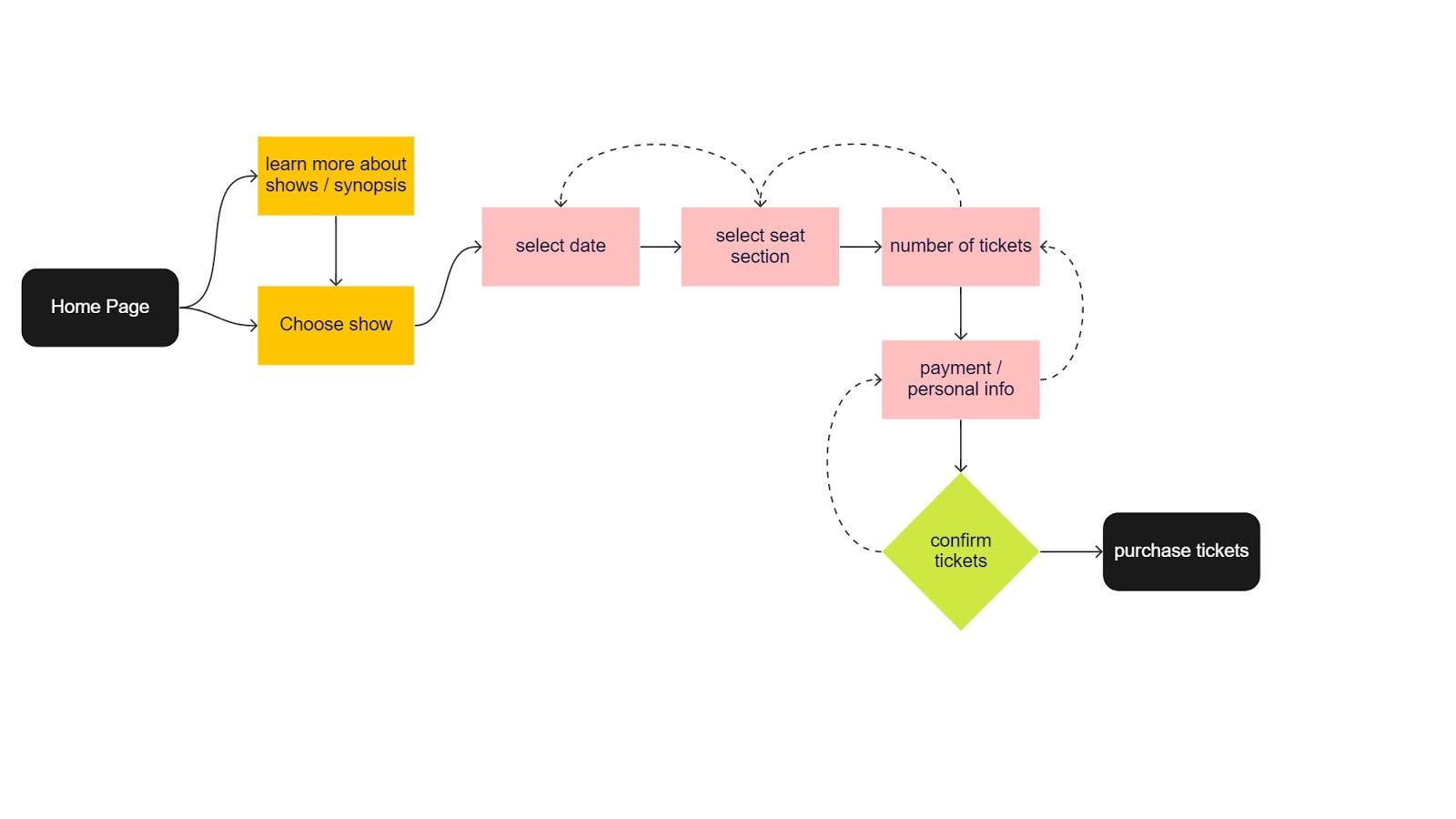
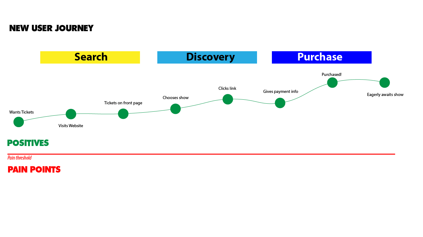
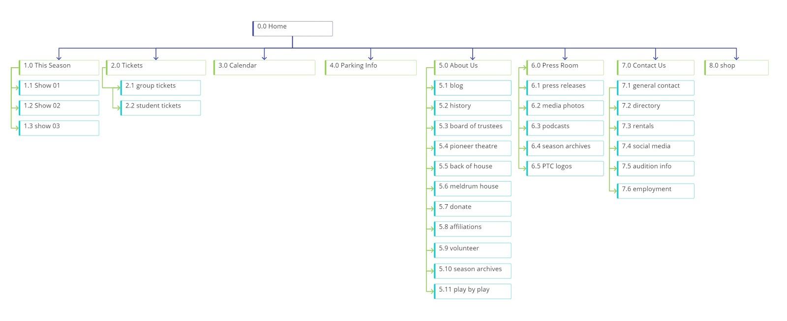
It shouldn’t be the user’s responsibility to search for buying tickets. Every opportunity should be extended to allow them to make tickets purchases simple and intuitive. That’s why they came, so we need to make it easy for them to accomplish their goal.
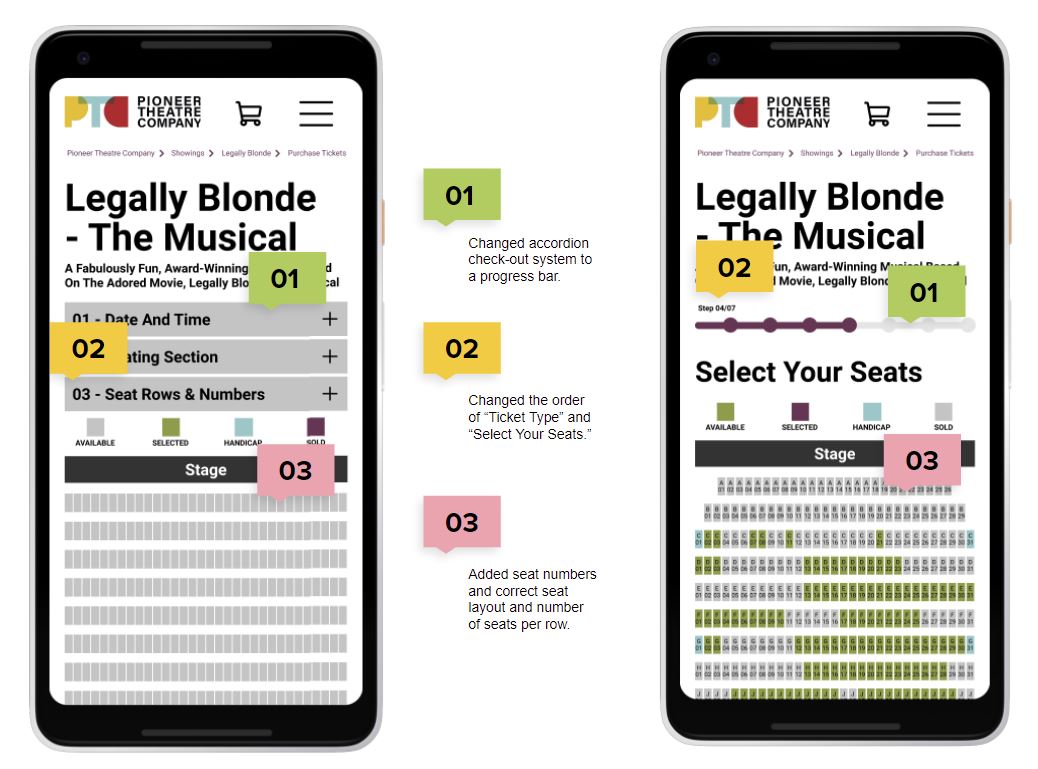
Continuing with this project our next steps would include, testing and validating the ticket purchasing process, add a donation process, potentially add accounts so you could sign in with your Season Pass information, and build the rest of the site. It would be very beneficial if there was a way to add discounts (such as their student discount) from the online portal as well versus having to purchase them over the phone or in person to verify you are, in fact, a student.
SAVANNAH HOPE NYRE
EMAIL ME: savnyre@gmail.com
FIND ME ON SOCIAL