EMAIL ME: savnyre@gmail.com
FIND ME ON SOCIAL


UTAH'S DRIVERS LICENSE DIVISION
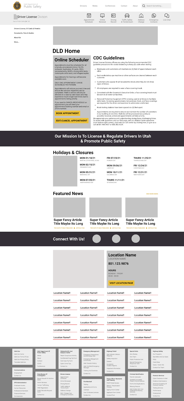
The Utah’s Drivers License Division has a website for users to go on and get information or change information for their own licenses. Most government websites don’t have the prettiest, or usable, user interface. This website is no different. It is not the worst site design we have seen but it definitely has some flaws.
Solo UI Designer
Approx Two Months
Figma
Google Drive
Miro
Adobe XD
Trello
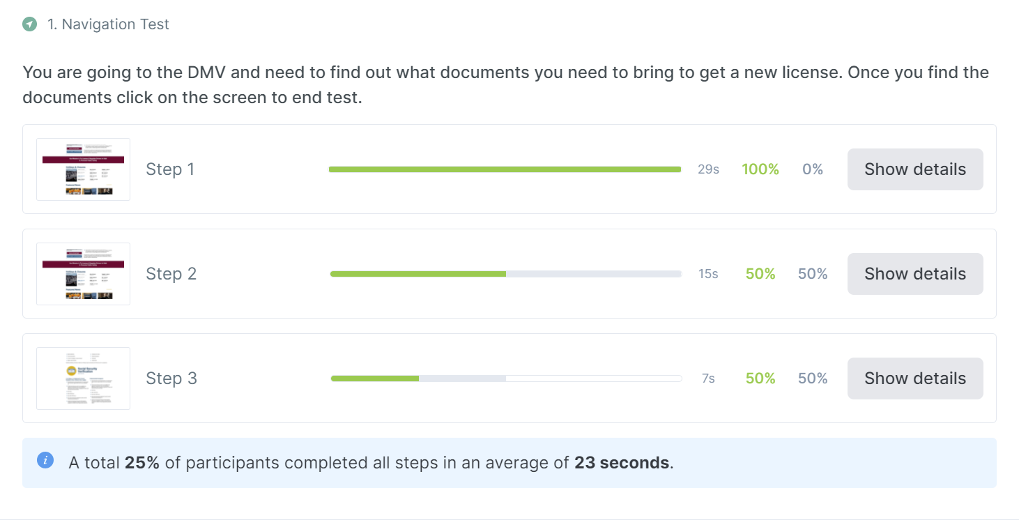
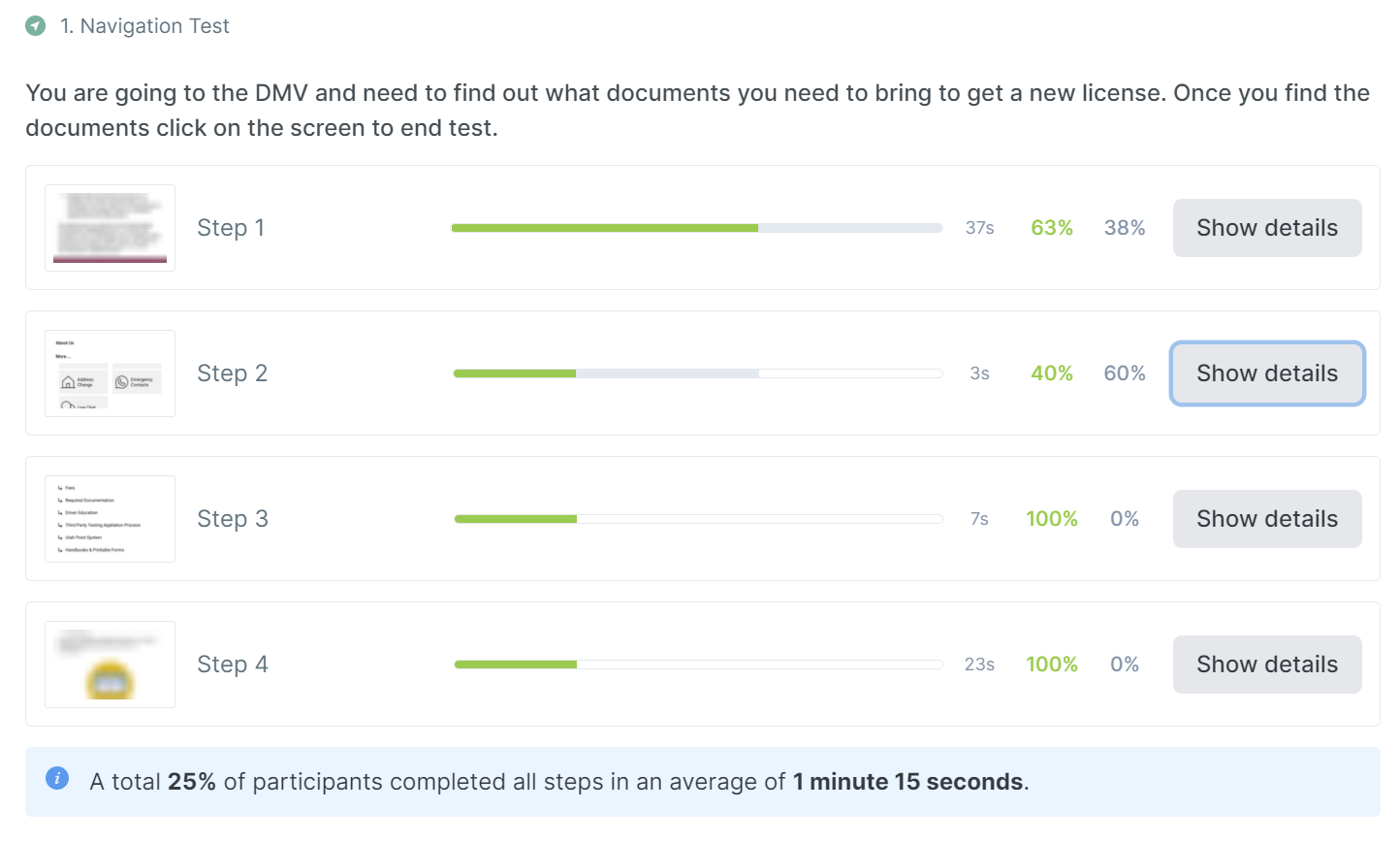
In this project we wanted to interview five different people who would want to be able to look online to find what kind of documentation they would need to renew their driver’s licenses. Since this is a fairly standard procedure for just about everyone, we wanted to have a mixture of people that would have different types of ID documentation to bring in. ie citizens and non citizens. We wanted to analyze how easy it would be for everyone to find what they were looking for and make sure they were ready to go while heading into the DMV.
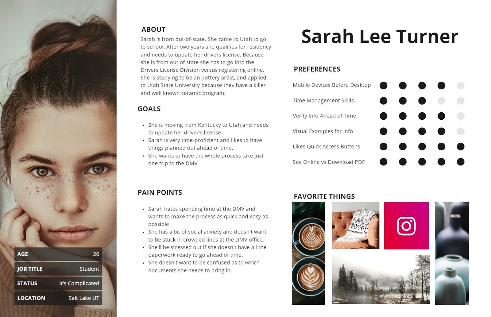
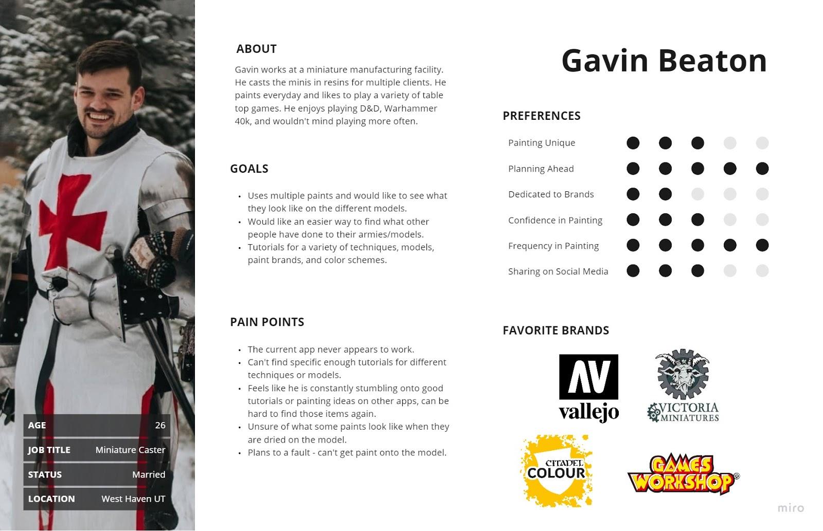
I created a proto-persona of someone who would be accessing the Drivers License Division website trying to find what kind of required documents they would need to bring.
I decided to interview anyone I thought would ever use the Utah Drivers License Division website. Which was almost everyone I knew, as most of them live in Utah.
“Oh goodness… This text is hard to read. It looks intimidating and I can’t see what i need at a glance… I feel like this page doesn’t actually give me the information I need… Why do I have to download a PDF to find the information that should just naturally live on the site?”
“My eye immediately went to ‘Online Renewal’ and it felt like that was where I should have gone…. That took me to an external website and definitely didn’t give me any information that I needed. I would have loved to just have the info right there instead of having to download the PDF.”
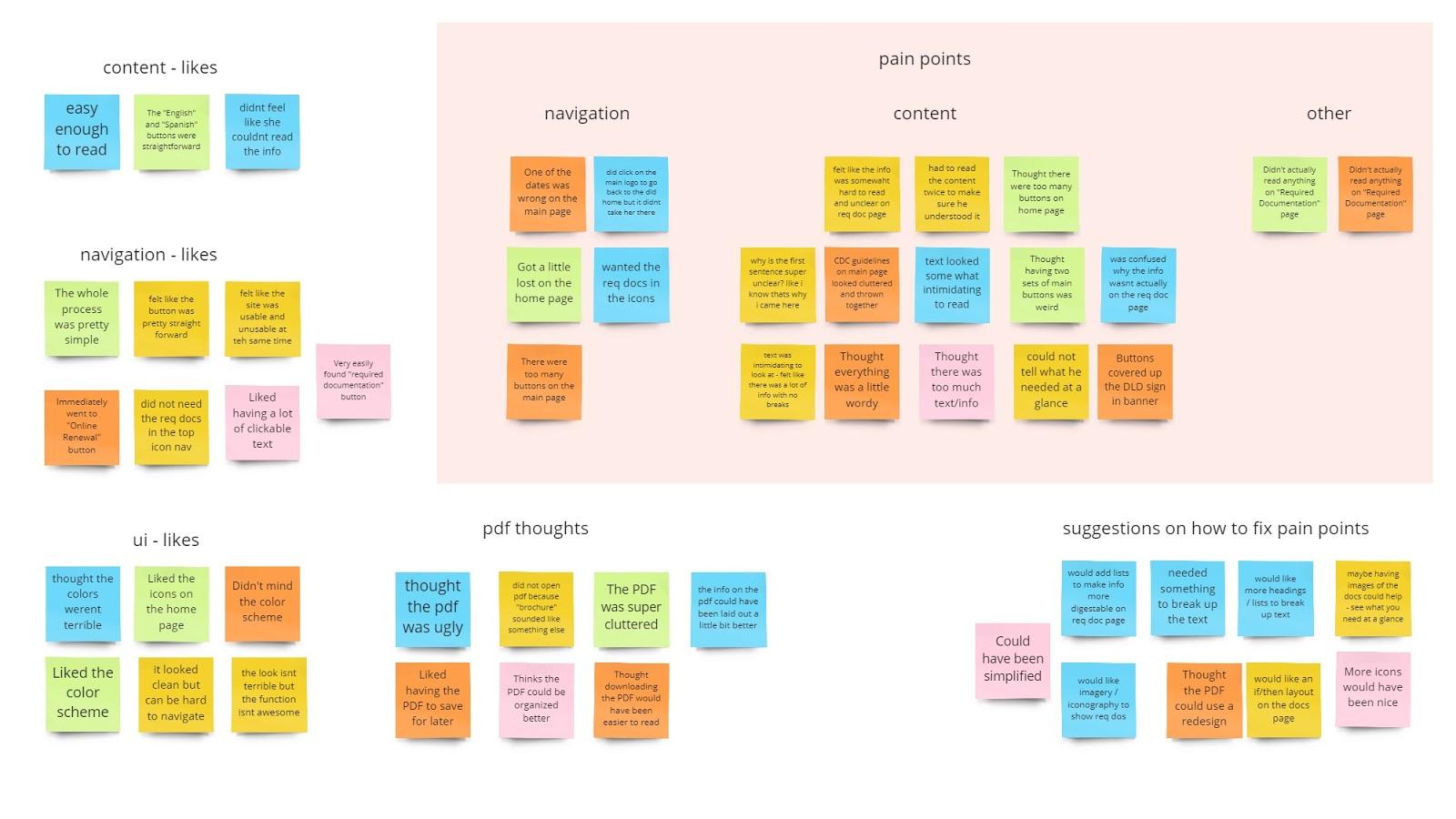
I decided to test some users on the current website design to see what their current likes and dislikes are. I then gathered what they said and turned it into an affinity diagram.
The navigation for the most part, minor issues, but usually easy to understand.
The content blocks and desired a cleaner look and for the content to be broken up.
To re-read the text to understand what they had read, or download a PDF to find info that should have already been there.
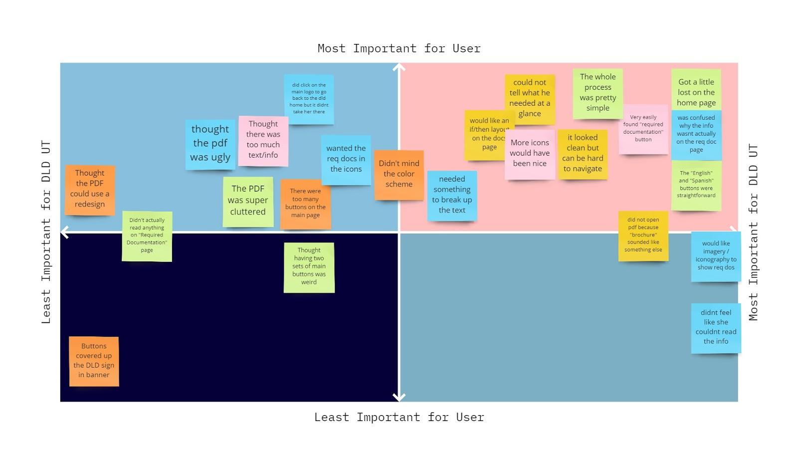
After I completed the affinity diagram I decided to measure the importance of the needs of the uses by putting them on a matrix. This way it would be easier to determine what would be the most beneficial thing to work on first when comparing the user and the stakeholders needs.
After testing the users on the current site I went through and determined issues on the site. This would help remind me visually of any issues users had when looking at the site. Then after I put on all the users' issues on the site I also added anything else that needed to be added, such as an color evaluation and some other usability issues.
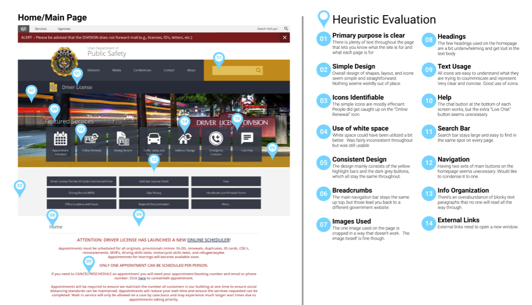
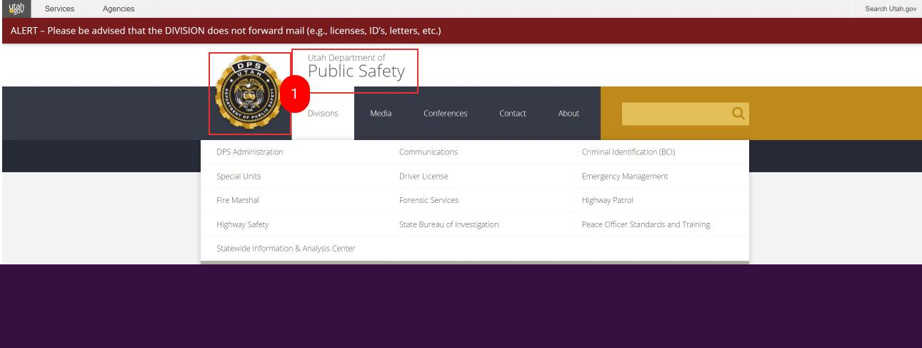
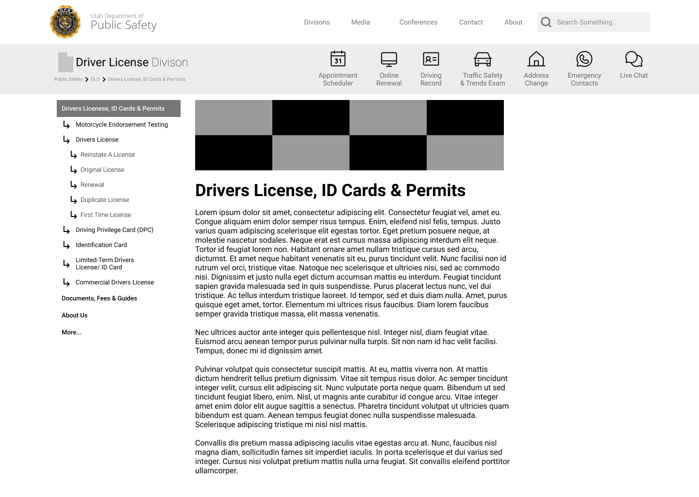
We believe that this section of the navigation needs to be fixed for a few reasons. One reason is that this site dld.utah.gov is part of a larger site. You can see in the domain name, that this is actually a subdomain. The interesting part is that this subdomain links out to other subdomains related to the Utah Department of Public Safety (all shown in the image above, in the “Divisions'' drop down). Clicking on either the logo or the “Utah Department of Public Safety'' will take you to publicsafety.utah.gov.
We wonder if making this less prominent, or even just taking off the logo/badge, users will no longer click on it to go back to their designated divisions main page when it really takes them to a different page entirely. Most users may not recognize they are on a subdomain of utah.gov so when they click on the badge they are trying to go back to their divisions page, but then they instead are surprised by the other home page. We both did this to other selves when looking at the stie, and we suspect users will too.
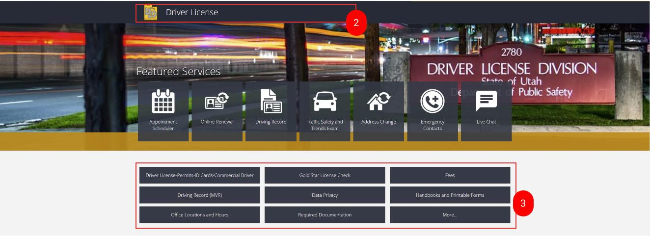
When clicking this marker you are taken back to the Drivers License Division main page. This is not very well seen, or understood at a glance. We wonder if making this more prominent, or turning it into a breadcrumb, will help users navigate around the site more easily and then they will know they are on a larger site. For example if instead it was dld.utah.gov, you are on the “required documents” page that appears to fall under drivers license, somehow. What if instead it had a breadcrumb that could say: Dept of Public Safety > Drivers License > Required Documentation. This way the user could then click on the different parts of the breadcrumb and navigate the site more fully and with clear logical steps.
There are currently so many buttons to click on, plus a “More” button that brings up almost double the original buttons. The whole thing just seems cluttered and thrown together a bit. A better solution would be to organize these links in a sidebar with dropdown options to group things together in a way that makes sense and cleans up the navigation. This sidebar can then be added to every page to make navigation throughout the site much easier. It also clears up the clutter underneath the “Featured Services” and doesn’t detract from those buttons.
“What if i clicked on the wrong one and wanted to click on the right one. But then because it takes you to a page and hides it from you, I could think that it wasn’t there and just end up clicking the back arrow on the browser. I almost did”

this is a paragraphs
paragraphs
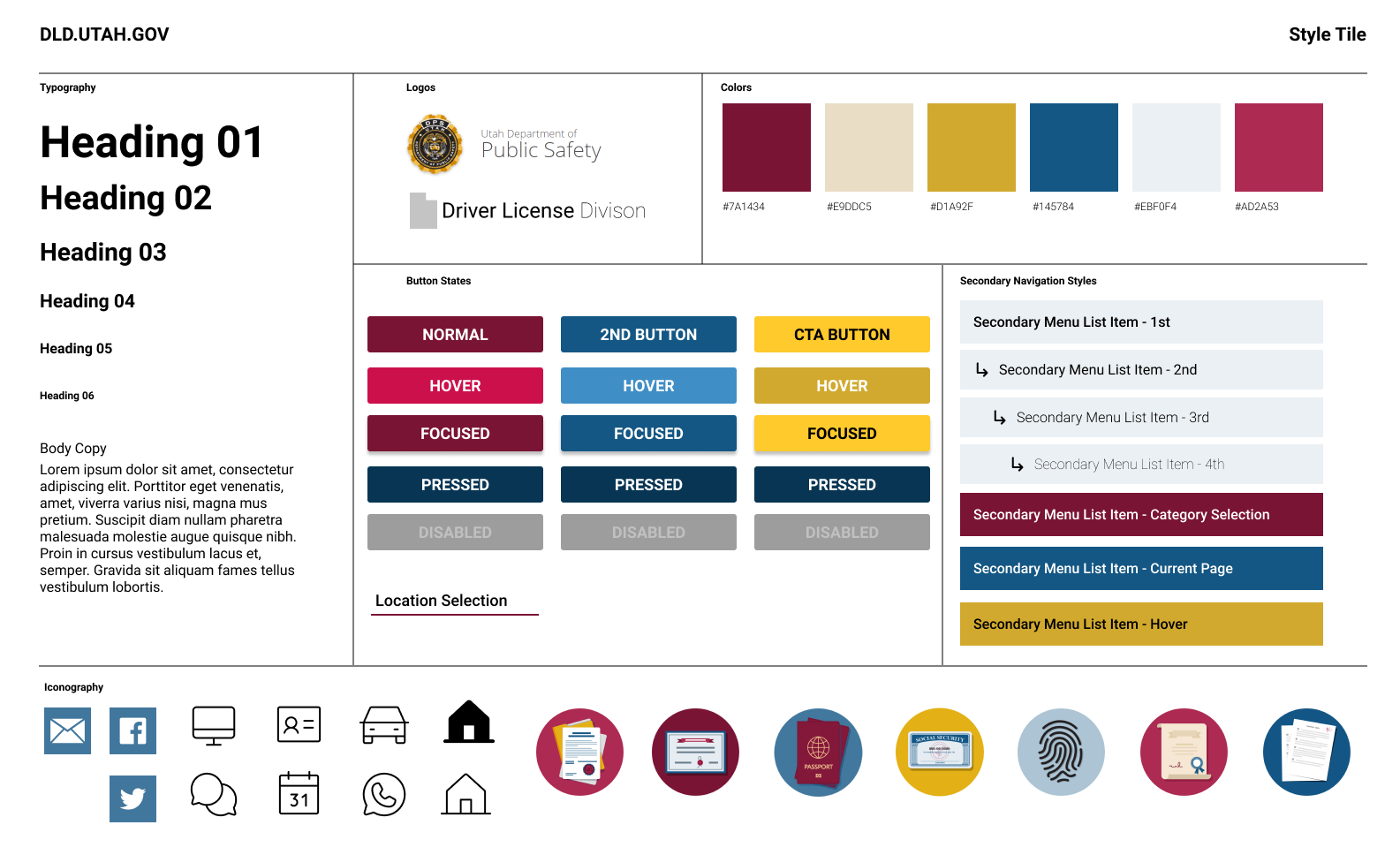
Some interactions included adding a background color to the secondary navigation side bars. And then also keeping the footer simplified like on the current site.
During this project I wished that there were more people to user test. I eventually found a service that would kind of let you test more people, if you paid. I would love to try to use this feature more in the future. It was fun to use for the five second test, as well as getting heatmaps.
If I were to continue this project I would keep testing the navigation and making other pages for the site to validate that the navigation works because it would go to multiple different pages. Basically it would also allow me to test multiple user paths and see what would work better in the future.
SAVANNAH HOPE NYRE
EMAIL ME: savnyre@gmail.com
FIND ME ON SOCIAL